BACKGROUND
Today more people are working from home than ever before. Lack of ergonomic knowledge can lead to chronic physical pain. I wanted to know how users are working from home and if they knew how to ergonomically set up their home offices.
OBJECTIVE
Find people working from home that have a dedicated work area and educate them on basic ergonomic best practices to prevent health problems.
MY ROLE
This project was solely done by me for a UX/UI immersion program from September 2019 – January 2020. I followed the 5 stages of design thinking to complete this project, empathize, define, ideate, prototype and test. The programs I utilized were Sketch, Miro, Illustrator, Marvel and Invision.
Research
Leveraging my online student community, I conducted a survey targeting people that were currently working from home. I asked them, if they were in pain from sitting all day? Did they have an understanding of ergonomics prior to working from home? What equipment did they have at home? How did they go about setting up their space?
Synthesize
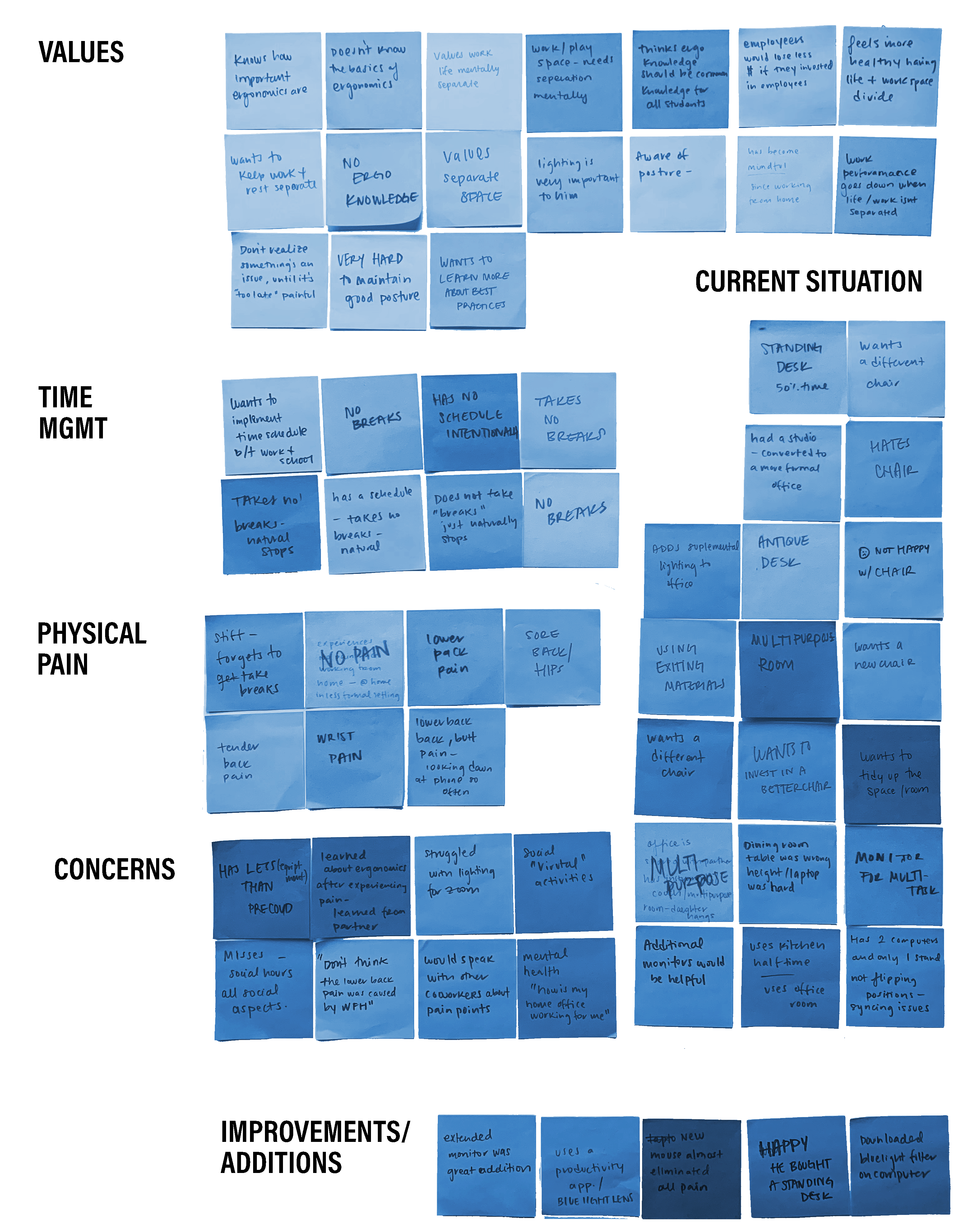
1 of 8 people had consulted ergonomics best practices while setting up their space
All 8 individuals were dissatisfied with their desk chairs
All 8 individuals mentioned they didn’t take breaks during their workday and didn’t have a firm schedule implemented
Define
| How might we recommend basic but quality products and office equipment that improves users home office set up? | How might we teach people working from home best practices and copacetic habits to prevent injury? | How might we encourage users working from home to take necessary breaks to create a better work/life balance? |
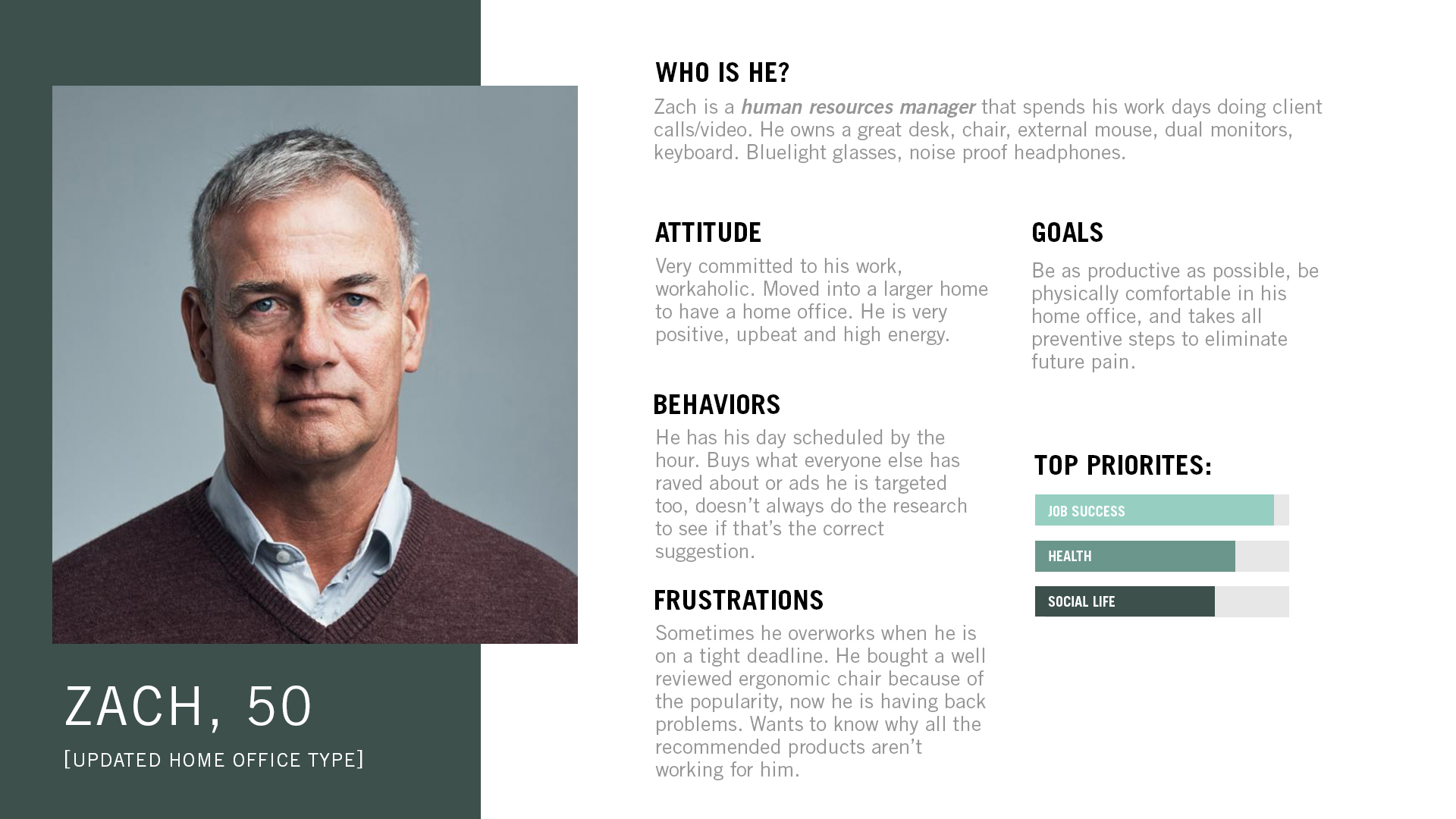

As a User…
| I want to learn to set up my home office | In order to not be in pain anymore while I work from home. |
| I want to self assess my home office and posture to see how I am doing | To prevent injury |
| I want to learn to step away from the computer | So my body and eyes get a break from work and I can rejunvenate myself |
| I want to learn how to set at my desk properly | So I can prevent injury in the future. |
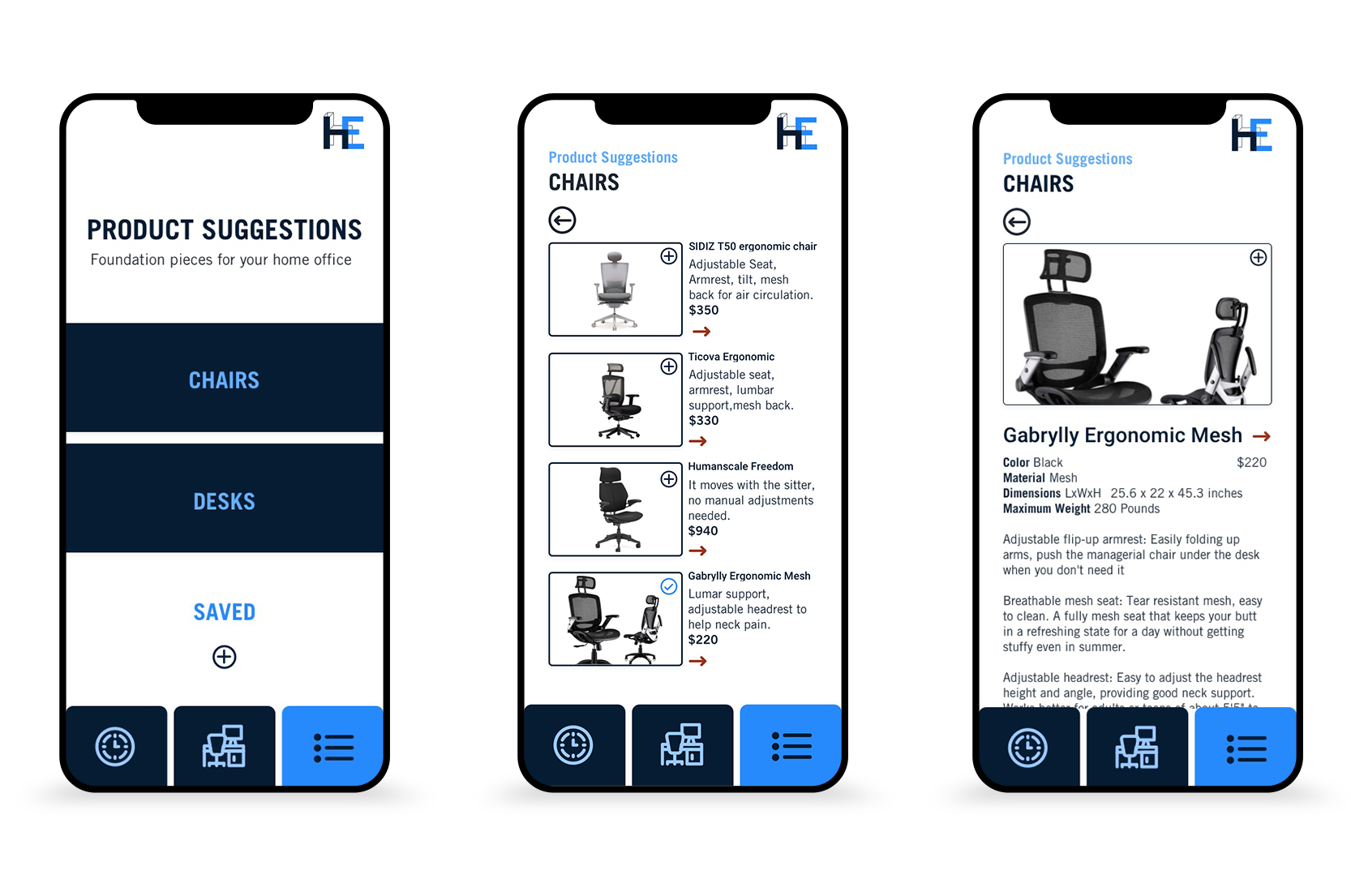
| I want to know what desk equipment is ergonomically right for me | So I can purchase the best option for myself without doing too much research. |
Ideate
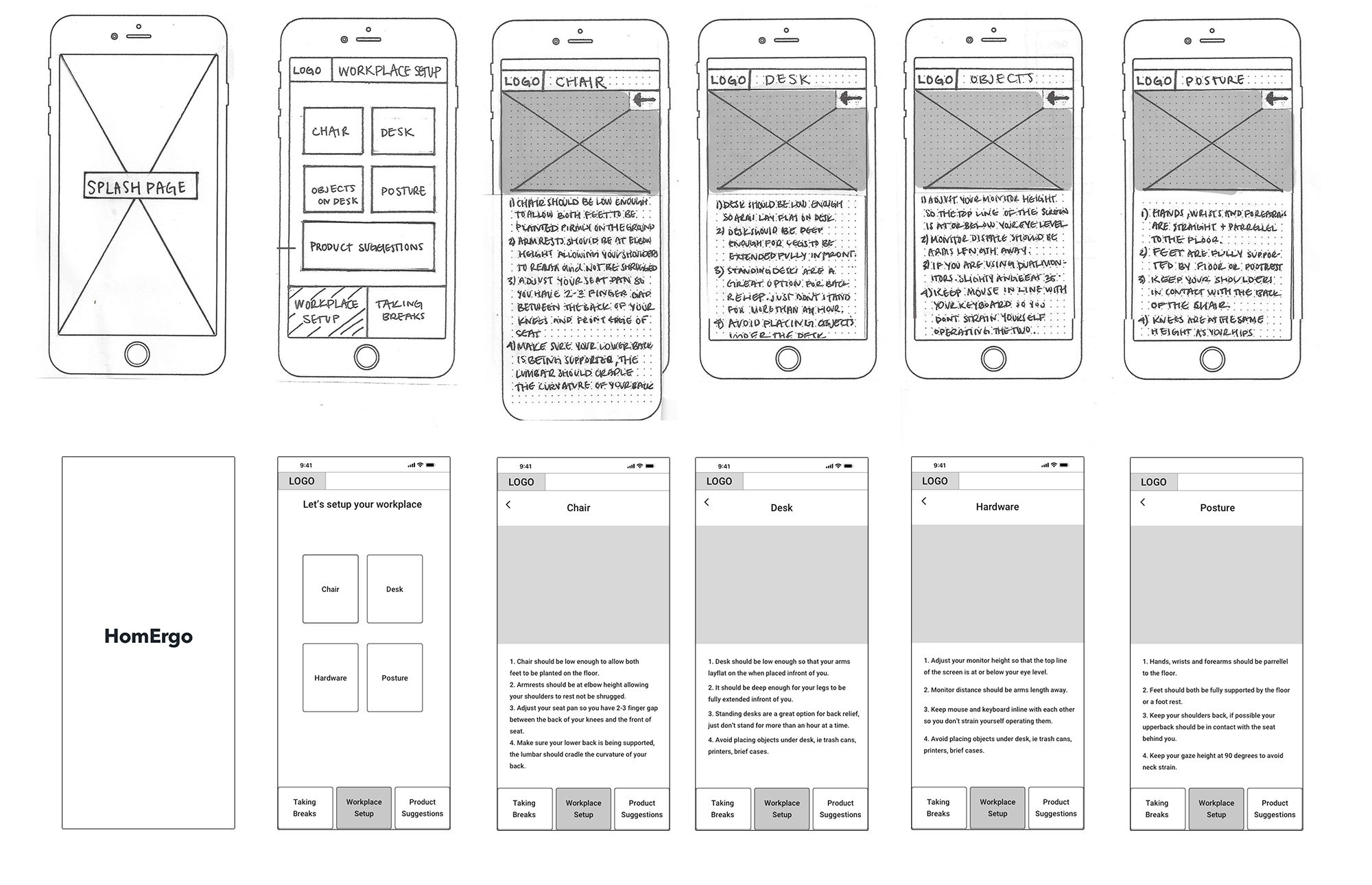
Using my 3 problem statements as top priorities. I created sketches and uploaded them to Marvel to conduct guerilla usability tests. Keeping my sketch content relatively vague I was able to listen to what the users would expect to be learning while using the product. With user feedback I refined by layout and hierarchy and created digital wireframes using Sketch.
Branding
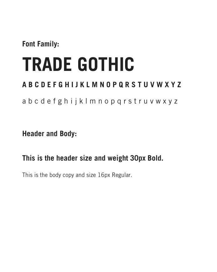
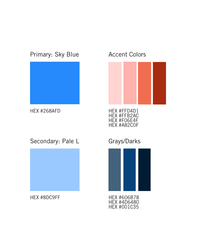
I wanted this app to give a sense of ease and reliability, I wanted a convey a savvy and minimalist aesthetic. Homergo is friendly while empowering users to change their lives for the better through education and presentation of curated products to best suit their needs. Style guide created here.
Prototype
With my mood board as a starting point I created a color palette and began designing my high fidelity mockups in Sketch, bringing my app to life. I ran accessibility tests to audit my color palettes to guarantee optimum readability, legibility and sufficient contrast for the majority of users. When completed I uploaded to Invision completing my prototype to conduct usability tests.

Usability Testing
I conducted two rounds of usability tests. Testing 5 unique individuals each round. This was a critical step of learning if the app had ease of use and if the information was easily comprehended. Because this product is mostly educational I asked my users if the information was digestible in the manner it was presented. I also tested the organizational hierarchy and icon fluency. Each user was given simple tasks to perform and provided me feedback about hesitations, concerns and points of confusion. Keeping my MVP as top priority I took users feedback into consideration and updated what I saw essential to my product.
Changes Implemented After test
- Headings were rewritten to be less vague. The wording had previously confused users.
- The iconography I choose wasn’t obvious enough for all users, new icons were implemented to avoid confusion.
- Illustrations were made more exact to the rule they were representing.
Conclusion
My favorite part of this process was learning to wireframe and figuring out how to successfully reveal information in clear a concise way. Learning to use Invision and seeing the wire come to life was very exciting.
If I were to do it again I would ask double the amount of questions, this process taught me how important primary research is and coming up with quality questions is critical. Doing that further research would inform what other features to include to motivate the user to return to the product. Currently the app provided the basic education I wanted to deliver but for long term engagement I would need to offer more features.
User testing was the most stressful and rewarding part of the process. Seeing your project through others perspectives was humbling and eye opening and absolutely necessary when you are working as a team of 1.
